 Identity · Packaging · Web
Punjabi warmth, served on a New Jersey street.
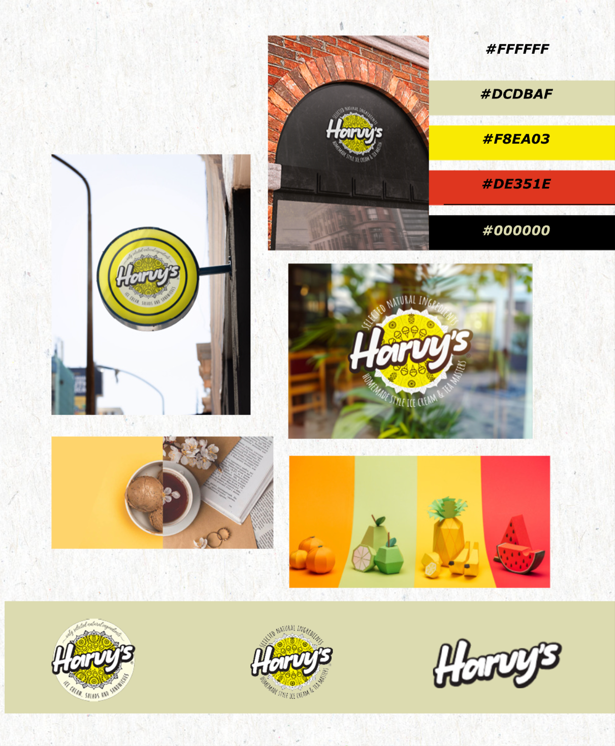
Harvy’s makes homemade-style ice cream and chai with Punjabi roots. The identity had to feel like summer, yet hold its own beside the big dessert chains.
I built it around one circle: a stamped badge that works on shopfront glass, hanging signs and tub lids. Turmeric yellow and chilli red carry the heat; a soft sage keeps it from shouting.
Logo system — Signage — Menu — Tubs — Cups — Website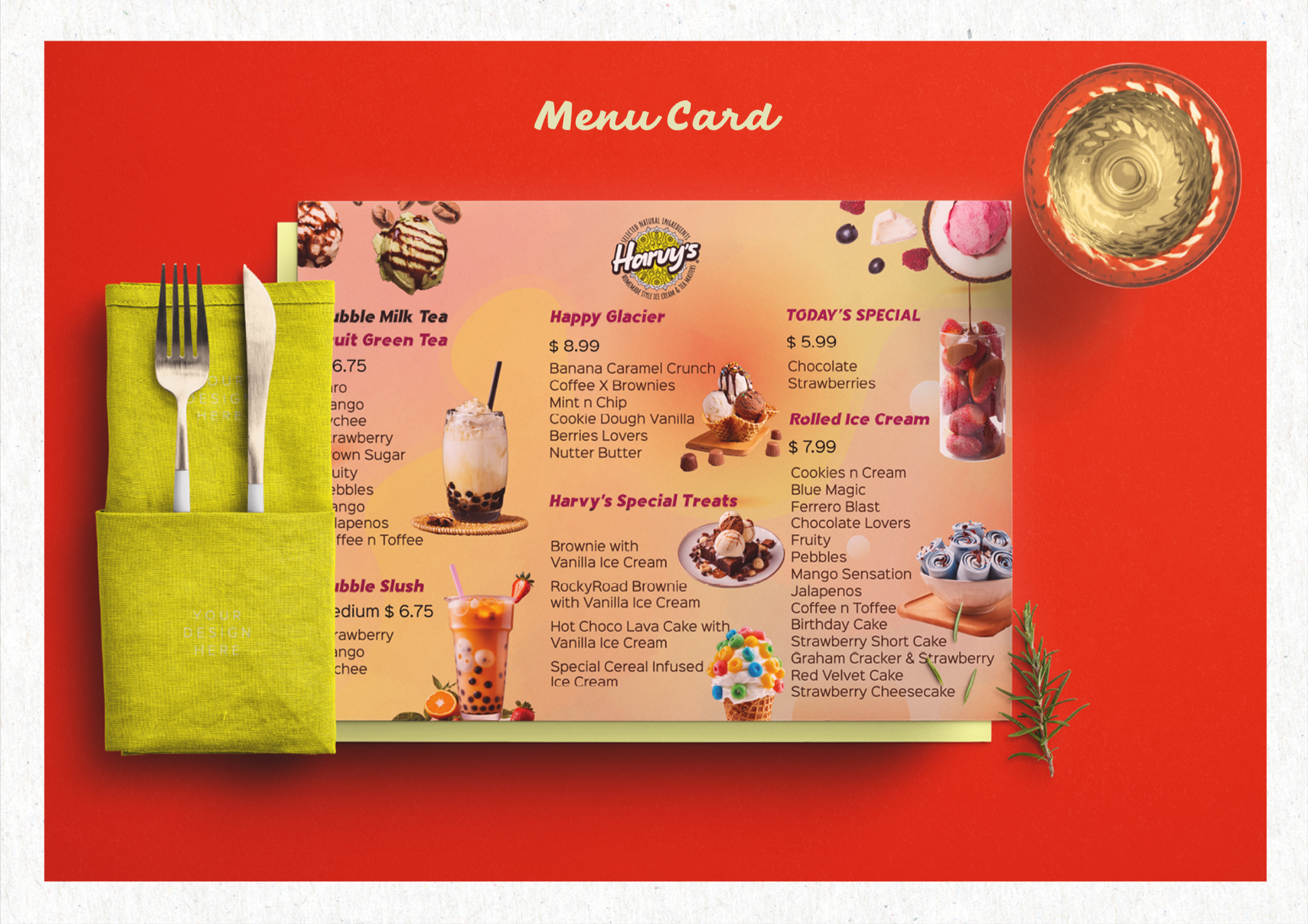
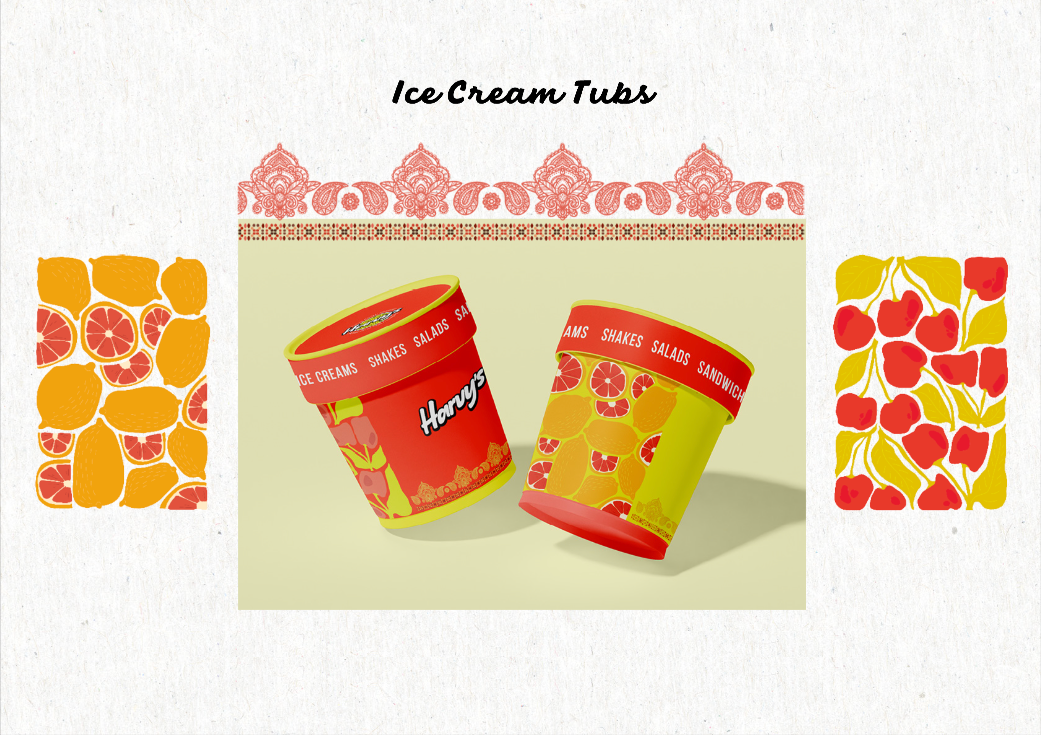
Hand-drawn paisley borders and fruit prints tie every tub back to home.
Packaging — Takeaway cup
New York,
New York,
in bloom.
A hand-drawn Chrysler Building wrapped in cherry blossom, in white ink on black. Every takeaway cup carries Harvy’s city-café story out of the door.
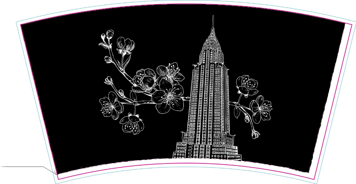 16oz double-wall cup · Flat print layout
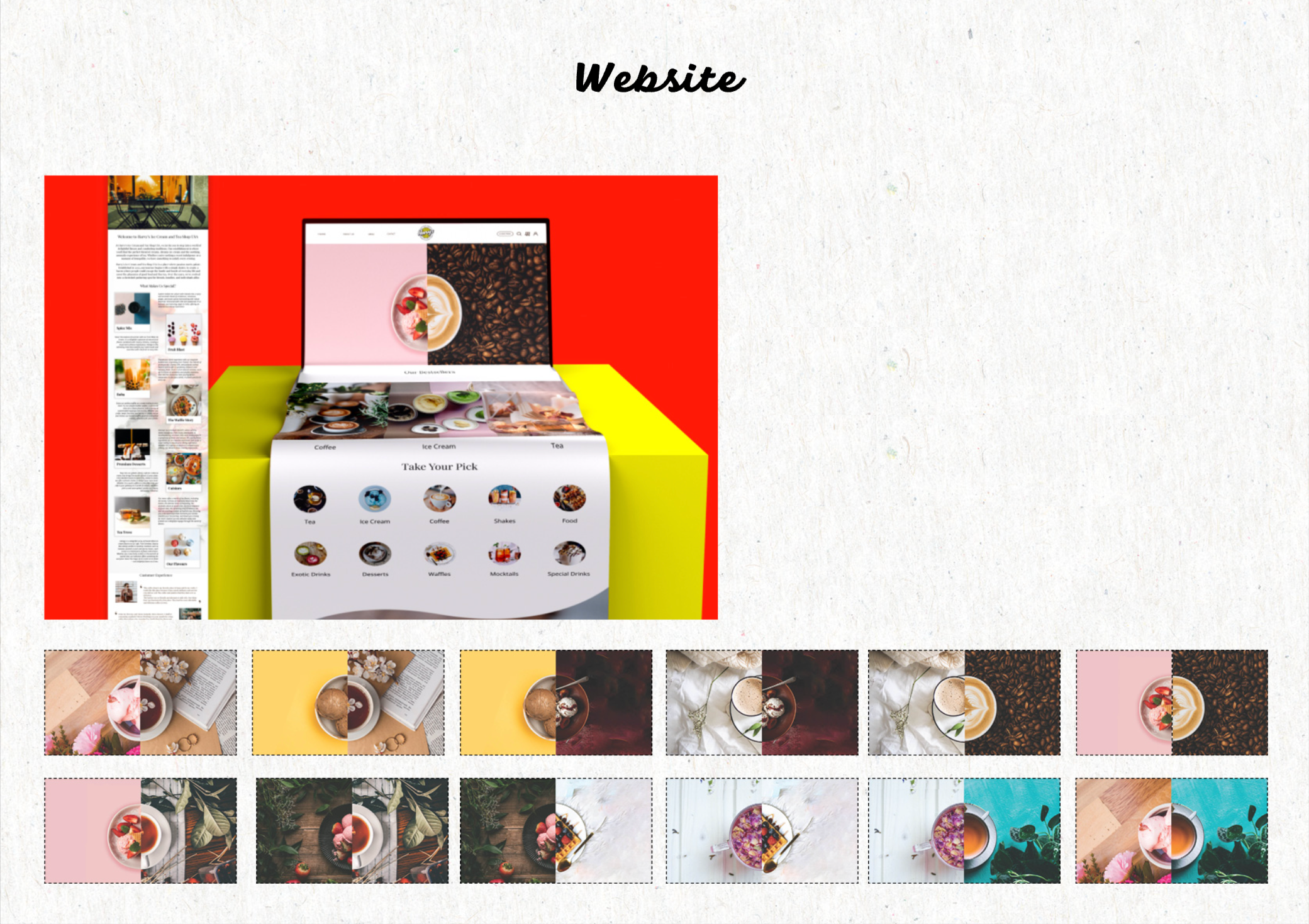
Website — Take your pick
Half ice cream, half chai. You choose.
Every menu tile is split down the middle: one side scoop, one side cup. Pick a pairing and order in a tap.